Background
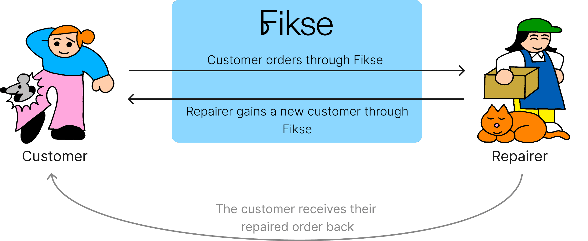
Fikse connects users with skilled repair professionals and forwards bookings to our network of third-party experts, thereby expanding their client base. The majority of the user base is female from the age of 40+ years old.


Challenge
The current booking process for Fikse has been identified as a pain point for users, leading to high drop-off rates and potential missed revenue opportunities.
Project Goals
Solution
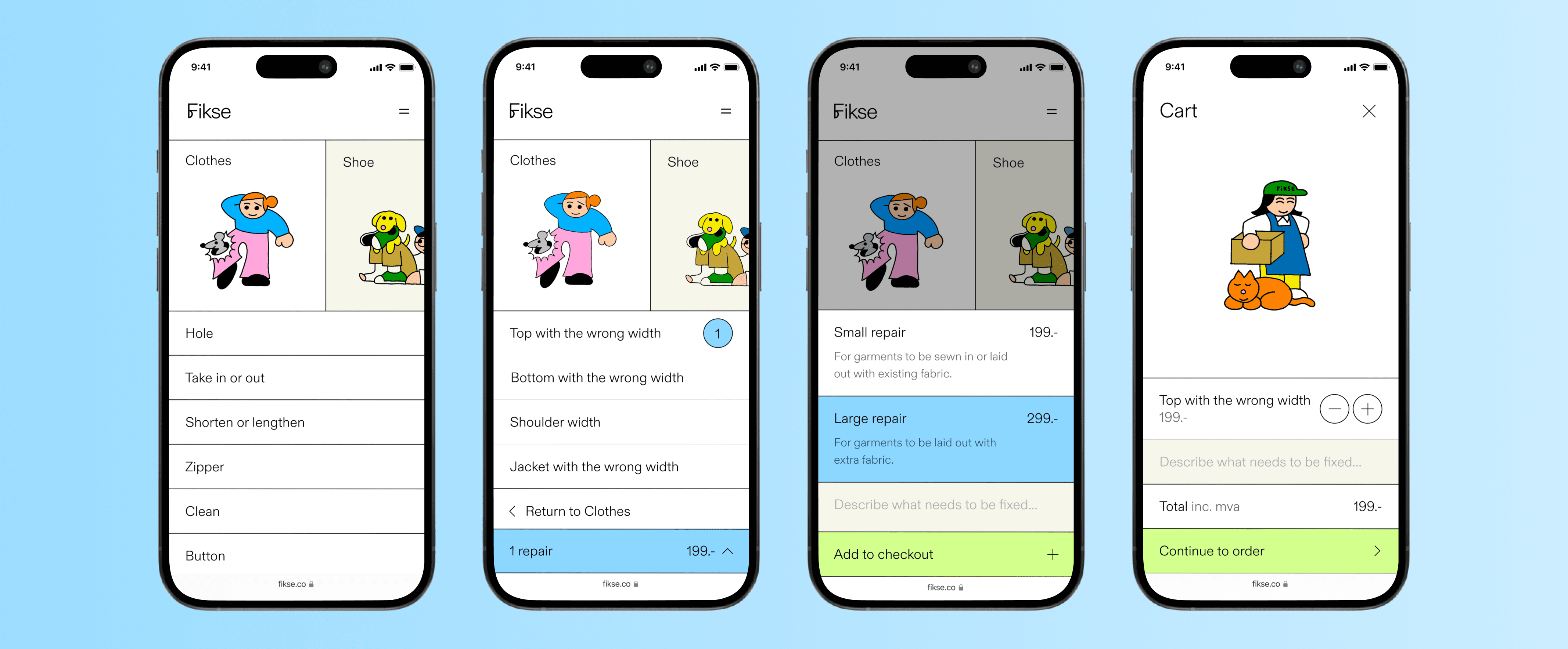
Restructured the presentation and categorization of information by grouping repair options where they naturally fit together. The "After" solution provides less 'information overload' and helps users choose the correct repair option.
After
Implemented two standardized repair pricing models with information about each repair and a visual highlight when selected.
Before

After
Users can provide a detailed description, specifying the relevant information about the issue with the garment to the repairer. The previous design did not have a user repair description.
Before
After
2023, April
19
8
700+
60%
5 Design Awards
Research
To understand user experiences and identify pain points, we conducted interviews, workshops, and evaluations with our users and product owners to gain detailed user insights.
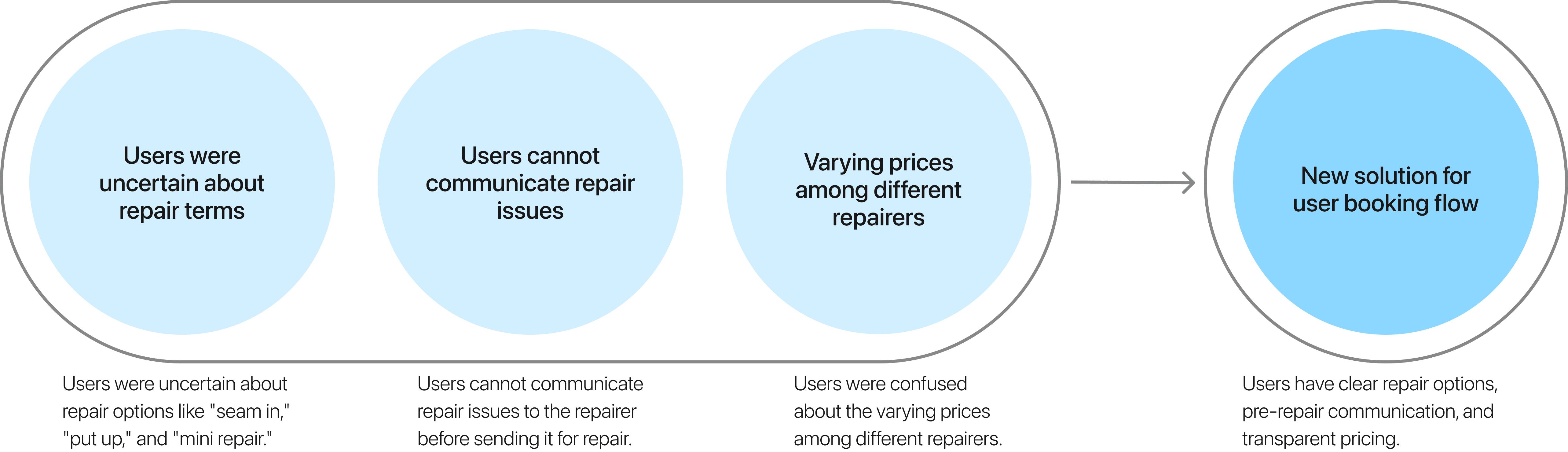
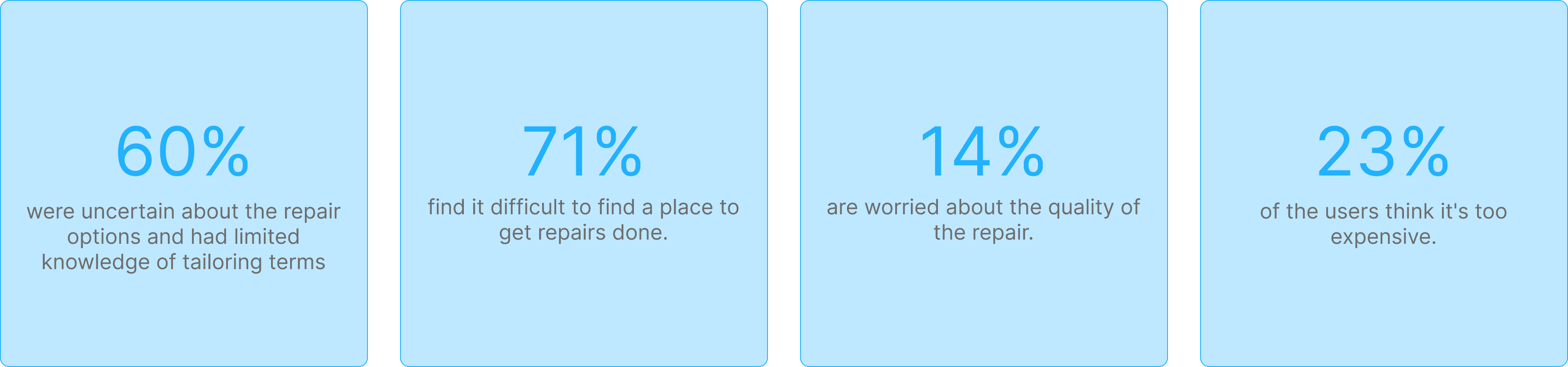
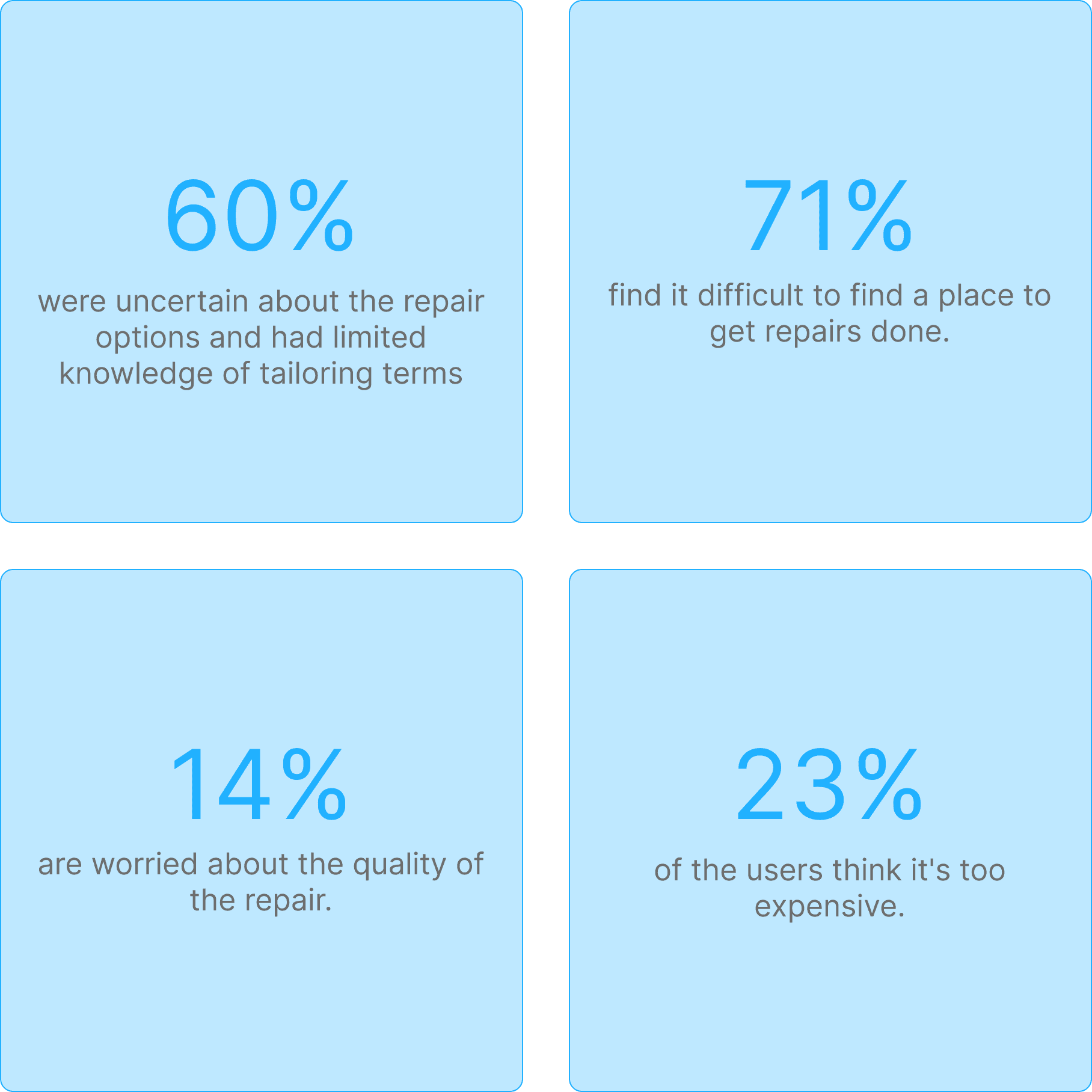
Sixty percent of users aged 20 to 40 had limited knowledge of common tailoring terms such as "seam" and "take in." This gap hindered a smooth user experience and created confusion among users when choosing a repair option.
Design Limits User Input on
Repairs and Communication
The existing design forced users to choose preset repair options without allowing them to add their own descriptions of the issue. Users could communicate with the repairer only during the physical delivery of their garments to the workshop.
Users Uncertain If Lower Prices
Mean Lower Quality
Users were confused about the varying prices among different repairers, questioning the reasons for the price differences and whether cheaper options indicated lower quality.

Research-Driven Start Built Our
Strong Foundation
By starting with a research-intensive approach, we established a solid foundation for our work.
"I'm not familiar with tailoring at all, so I don't know which repair option I should choose."
"Quality is my main concern. I worry that cheaper repairs might mean sacrificing quality."
"Quality is my main concern. I worry that cheaper repairs might mean sacrificing quality."
User persona: Frank

Frank, 35
Salesperson
User persona: Markus

Markus, 39
Lawyer
Seeks an efficient booking system for tailoring and repairs, avoiding multiple shop visits.
As a hiker, he needs reliable repairs to quickly fix rips and damages.
He is unsure about repair options like "take in" or "mini repair," fearing that this uncertainty could lead to mistakes in service requests.
He struggles to find time for repair visits and seeks a service that integrates smoothly into his routine.
Pain points
Confusion over terminology
Overwhelming choices of repair options
No pre-drop-off communication
Perceived complexity of process
Confusion regarding pricing
Causes
Information overload
Overwhelming choice during booking
No option to describe repair order issue
Too many repair options
Too many unclear pricing options
User journey: Marie
Marie, a real estate agent, recently noticed a tear in her favorite blazer just before a crucial client meeting.
She seeks clear repair options on the Fikse platform to make confident repair choices.
She expects clear and efficient communication with tailors to ensure accurate and satisfactory repairs.
She prefers to mail the blazer due to her busy schedule.
Marie, a real estate agent, noticed a tear in her favorite blazer before a crucial client meeting. She opted for Fikse's online platform for their repair services.
She visited Fikse's platform to choose a repair option but hesitated, unsure about the appropriate choice for her issue—whether 'mini repair' or 'patching'.
Marie hesitated briefly before choosing 'patching'. However, she remained uncertain about whether it was the right choice and worried about potential cost implications.
Marie wanted to describe her blazer's complex tear during the booking process but lacked a feature to write her own description. This left her concerned about potential repair times and costs.
Marie hesitated, preferring to describe her garment issue and seeking clear communication with the tailor before deciding whether to send the blazer by mail due to her busy schedule. She is also confused why there are five price options and wonder which to choose.
After thinking it over, Marie decided to visit the nearest Fikse tailor in person to discuss the repair details, opting not to make an online booking and payment.
At the tailor's shop, Marie explained her repair needs clearly, received confirmation on the repair method and cost, and scheduled the drop-off, ensuring her blazer would be ready in time for the event.
Marie skipped using the Fikse platform and visited the tailor in person to discuss her issue and pay, adding extra effort and complexity to the process.
Sketching
In this phase, the design team explored a variety of ideas and sketches, prioritizing creative diversity and avoiding tunnel vision. We embraced the principle of "More is more," fostering an environment of open contribution without premature criticism. Here are some of our sketches:

Prototyping
The design team brainstormed and created prototypes from the best concepts, transforming them into wireframes to visualize the user experience. This iterative approach allowed for continuous adjustments to address user concerns and ensure an efficient and user-friendly solution. Here are some of our prototypes:

Design Iteration 1
To determine the best way to help users understand repair options, we conducted a workshop to develop an ideal user flow and information architecture. It became clear that we needed to categorize options, group repair options where they fit together, and present the repair flow so that users can easily understand which repair option suits their needs.


Upon sharing the initial design with the design team, I identified the need for an improved hierarchy. We made the product section larger but retained the same information architecture.

Once the hierarchy was finalized, we incorporated a fun personality into the interface for the final design.
Design iteration 2
To help users understand pricing options, we held a workshop with the Product Owner and our repair partners. We introduced two standardized pricing options based on repair size to clarify that it is about size rather than quality, making it easier for users to choose the right repair service.


Design iteration 3
There was no user description box in the original design, so the design team added a text box for users to provide detailed descriptions of their repair orders.

User testing
We recruited 15 users and presented scenarios and design concepts with prototypes for feedback prior to development.
Positive overall responses confirmed our design direction. Additionally, user feedback identified valuable future enhancements.
Yunus, 33
"I'm not familiar with tailoring, but the new layout and repair flow is so much easier to understand. Now I know exactly what to choose!"
Fredrikke, 46
"Quality is still my main concern, but now I'm much more confident in which price option to choose and what it entails."
Marthe, 42
"The new way you guys present the information and the order of it is so intuitive compared to before."
Hanna, 28
"This is a step in the right direction. I'm really picky about the details of the repair. In the future, maybe I can upload a pic or video?"
Future enhancements
Design Handoff
I created a separate Figma file for developers and added a glossary explaining each Figma page. Additionally, I developed a high-fidelity prototype to enhance communication efficiency.

I included detailed design notes to assist engineers in estimating the effort required for each feature and design element. Using our design system, I specified the components and styles in the "Dev Notes," along with their respective pages for easy reference.

Meet Fikse