Impact
Live with 5 enterprise customers · 87% of users reported greater confidence after training.
Platform
Background
Attensi's desktop simulations were structured and in-depth, strong for complex scenarios. But that same format created two problems in the real world.

The insight: The user we really designed for
The sharper problem wasn't the format. It was who these users increasingly are. Much of the frontline workforce is now Gen Z: the hardest audience to sell on a long, desk-bound simulation, yet the ones who most need low-pressure practice for a skill to stick. That tension was the insight I pitched, and it became the product's foundation.

What the research showed
That instinct was backed by research. A 2024 Attensi survey of 2,000+ UK and US employees confirmed widespread anxiety around difficult conversations and strong demand for training, sharpest among Gen Z.
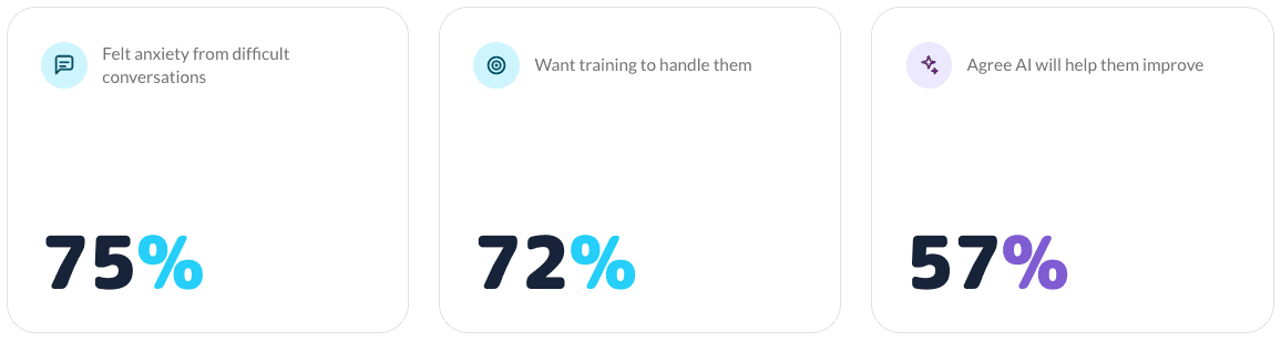

It also reshaped how I thought about the solution: people were genuinely open to practising with AI, splitting evenly between an AI trainer and a human manager, with 57% saying it would help them improve at their job. The discomfort of practising in front of a real person was itself part of the problem, and AI could remove it.

-
-
The bet
Skills RealTalk was the bet to close that gap, a new standalone product rather than an extension of the desktop tools: mobile-first, gamified, and built around short, repeatable challenges people would want to return to.
The central tension
One tension shaped much of the work: the people paying for the product and the people using it wanted opposite things. Resolving that, without quietly picking a side, was most of the design.

The risk
The bet still carried real risk. Even with demand and openness to AI established, two things were unproven: whether a short, gamified format could build real confidence rather than just feel like a game, and whether "fun" could succeed at the one thing the desktop tools failed at, getting people to come back.
Challenge
Three challenges defined the project. Two shaped the product's direction; the third became the heart of the design work.

-
-
Designing for two opposite audiences
This tension wasn't just a positioning problem, it was the core design challenge. Buyers wanted full, rigorous training; users wanted something short and fast. Designing for either alone was easy; designing for both at once was the real problem. Lean too far toward depth and users wouldn't return; too far toward simplicity and the training wouldn't be credible enough to sell.
A conversation with no design pattern to follow
Underneath that sat a harder problem: a freeform AI conversation had no design pattern to borrow from. Unlike a form or a checkout flow, there was no convention for how a user knows it's their turn, how the interface should handle unpredictable AI responses, or how to support both speaking and typing. I wasn't adapting a known pattern. I was designing one.

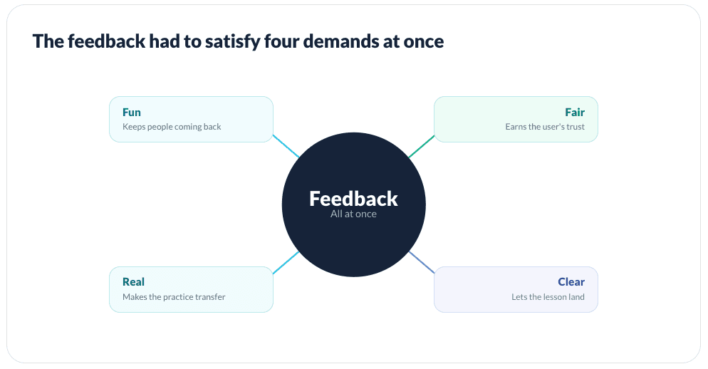
Feedback that had to teach, stay fair, and stay fun
The third challenge became the central one: the feedback. One question ran through the whole conversation: how do you tell someone how they're doing in a way that teaches, stays fair, and stays fun, without breaking the feeling of a real conversation? It showed up at three moments:

Design Principles
Four design pillars, all resting on one foundation: it had to be fun
From the first pitch, the product rested on a set of pillars on a single foundation: it had to be fun. Everything in Skills RealTalk, the tone, the pace, the feedback, was built to feel playful and rewarding enough to keep people coming back.

Underneath all four sat the same idea: if it wasn't fun, none of it would work, because the whole bet depended on people choosing to come back and practise again.
Role & Scope
Owning the design end to end, and building its foundation from scratch
I led the design and UX direction, working with the product manager and product owner on scope and priorities, and with the developers on what was feasible, deferring to them on technical limits and to the product side on business priorities. Knowing where to push and where to defer was part of the role.

Building the design foundation from scratch
Because the product had no design foundation to inherit, I built one: its first component library and design system, the file structure and workflow, and how designs were reviewed, handed off, prototyped, and tested. Reusing those components kept the product consistent, made building new screens faster, and gave developers a clear shared reference that smoothed handoff. That structure was a big part of what made working as the only designer manageable.
Discovery & Research
Grounding the product in evidence, and choosing to design for the user first
The direction was grounded in evidence, not assumption. Attensi's years of data from existing products showed how frontline staff learn and where conversation training breaks down, and a 2024 Attensi survey of 2,000+ UK and US employees, which I drew on, reinforced it: widespread anxiety around difficult conversations, strong demand for training, and real openness to practising with AI. The research didn't overturn the direction so much as sharpen it, confirming the problem was real and an AI-led, safe-to-fail approach was one users would accept.
Training the skills people value most
One finding shaped how I thought about the product's value: asked which human skills would stay most important as AI grows, people ranked empathy, social skills, and emotional intelligence highest. The product wasn't training peripheral skills, it was training the ones employees themselves believed would matter most.

Designing for the user first
From the start, I made a deliberate choice about who to design for first. The product served two audiences with different priorities, the businesses buying it and the staff using it, but I prioritised the user: if the experience didn't work for the person actually practising, the training wouldn't get used, and nothing the buyer wanted would follow.
Mapping the constraints early
I also mapped my constraints early. The AI avatar tool had real limitations in how the character could be presented, and the whole experience had to work on a small mobile screen. Those shaped core decisions about how the AI was shown and how the conversation was framed from the start.
Solution
Designing feedback as three moments, each balancing fun, fairness, and realism
Of everything in the product, the feedback was hardest to get right, because three forces pulled against each other at once. It had to be fun, or people wouldn't come back. Fair, or they'd stop trusting it. And real, or the practice wouldn't transfer to an actual conversation. Any one alone is straightforward; holding all three at once, in real time, on a phone, was the real design problem. So I stopped treating "feedback" as a single feature and designed it as three connected moments, during the conversation, in how it was scored, and after it ended, tuning each against those same three forces.

Feedback in the moment
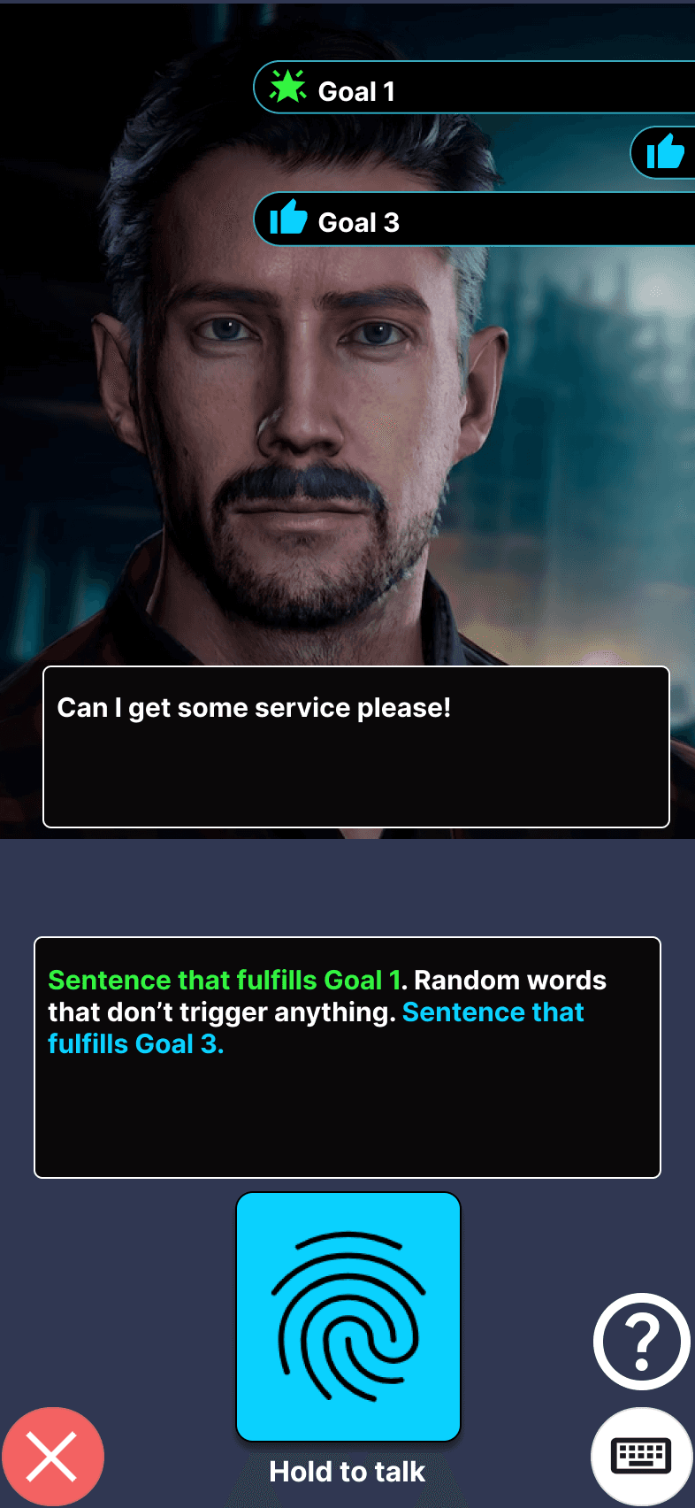
The hard part of live feedback was making progress legible without breaking the conversation. Each scenario had goals the user had to hit, so I needed to show them, in the moment, exactly what they'd said that counted, while keeping it feeling like a real conversation rather than a game with a scoreboard.
My first instinct was to highlight the user's whole response. But it was too noisy: lighting up everything pulled focus and made the feedback harder to read, you couldn't tell what actually mattered. So I narrowed it down: when the user speaks, their response appears in a chat box with only the parts that scored toward a goal highlighted in green. They see at a glance which of their own words landed, in the context of what they said.
1.

2.

3.
To make that moment rewarding, the green text animates: the scoring words lift off as stars and fill the goal meter. This sat right on the line between fun and distraction, so it took the most tuning. Most effects I explored tipped too far and made it feel like a game; the stars-thumps-to-goal-meter balanced satisfying reward against not disturbing the conversation, and everything more elaborate, I cut. Internal testing made the call clear: the busier effects pulled people out of the conversation, the restrained version kept them in it. That direct feedback, not just my own eye, gave me the confidence to cut the extras. This was the fun pillar kept on a leash: enough to motivate, never so much that it broke the realism.
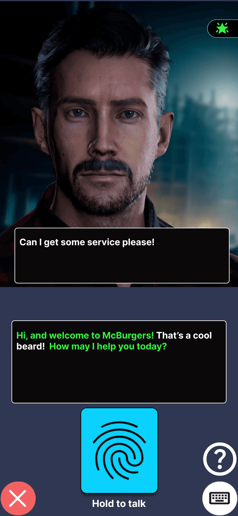
Thus changed how goals were scored. At first, a user could make progress on several goals in a single response, with multiple meters filling at once, green stars and a blue thumbs-up firing together. It was too much to follow. Digging into why, I realised the real fix wasn't calming the effects, it was the structure: users should focus on one goal at a time. So rather than showing all of a scenario's goals at once, I surfaced them one at a time, in order, each completed before the next opened up. That kept the user focused on the current step instead of scanning a checklist, and protected the feel of a natural conversation.
ADD A VIDEO GIF OF HOW IT LOOKS LIKE NOW
1.

2.

3.
Making the scoring fair
If fun was the pillar at stake in the live feedback, here it was fairness, and it was non-negotiable: a learning tool people don't trust is worthless. This was the riskiest part: the whole system rested on the AI correctly recognising when a user met a goal, and if it got that wrong, feedback felt random and trust collapsed. The risk was real, Flowise, the underlying AI tool, wasn't accurate enough at first, and teaching it to reliably judge a freeform answer was deeply technical. This was the one part I couldn't own alone, so I worked closely with a developer: I defined how the scoring should behave from the user's perspective, and together we tuned it until it did.
The clearest example was the star rating. Five stars was meant to feel rare and earned, but early on even a flawless run was usually capped at four. I noticed it first, and internal testing confirmed it: colleagues would complete a scenario exactly as the goals asked, still come back puzzled they'd earned four or fewer, with the AI inventing reasons that didn't hold up. That quietly destroys trust: if doing everything right doesn't earn full marks, and the explanation makes no sense, the score feels arbitrary. This took more iteration than any other part of the product, precisely because it mattered most, and over repeated rounds of tuning we closed the gap so a genuinely correct performance reliably earned the full five.
A second issue was in the feedback itself: when a user did well and there was nothing constructive to say, the AI would sometimes invent a critique to fill the space, or hallucinate one. That's worse than useless: it undermines trust and teaches the wrong lesson. I addressed it through prompting, so a user who earned full marks was simply told they'd done well, rather than handed a fabricated flaw.
Fairness wasn't only about the numbers, it was about how the AI behaved. I tuned the character toward believable realism: if a user was rude or dismissive, it reacted as a real person would, and the conversation could end in a game-over screen. That kept the practice honest and the consequences real, while staying a safe place to make mistakes.
The summary: clear over clever
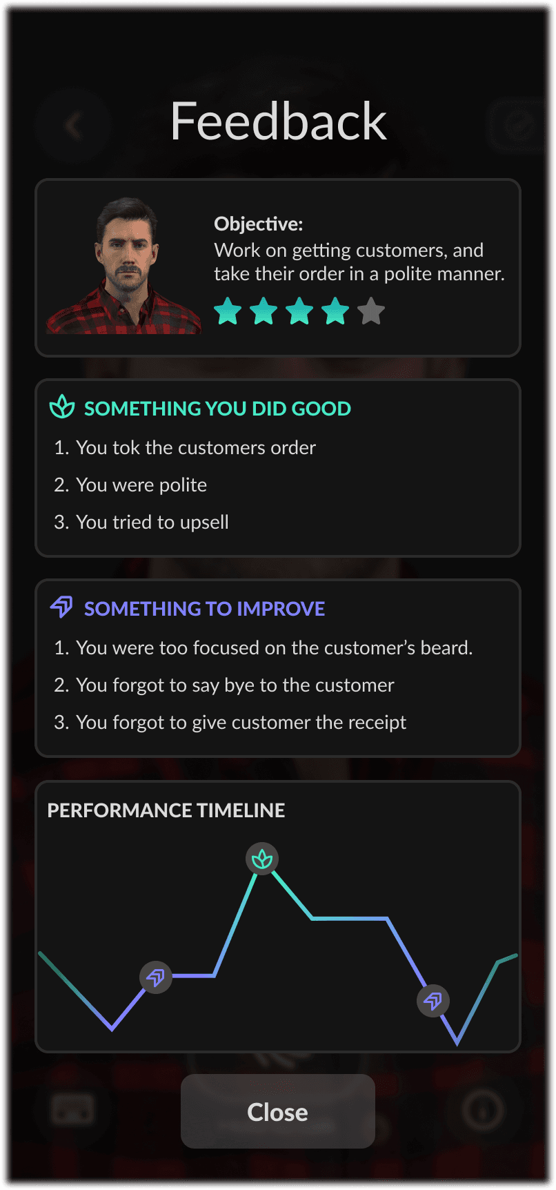
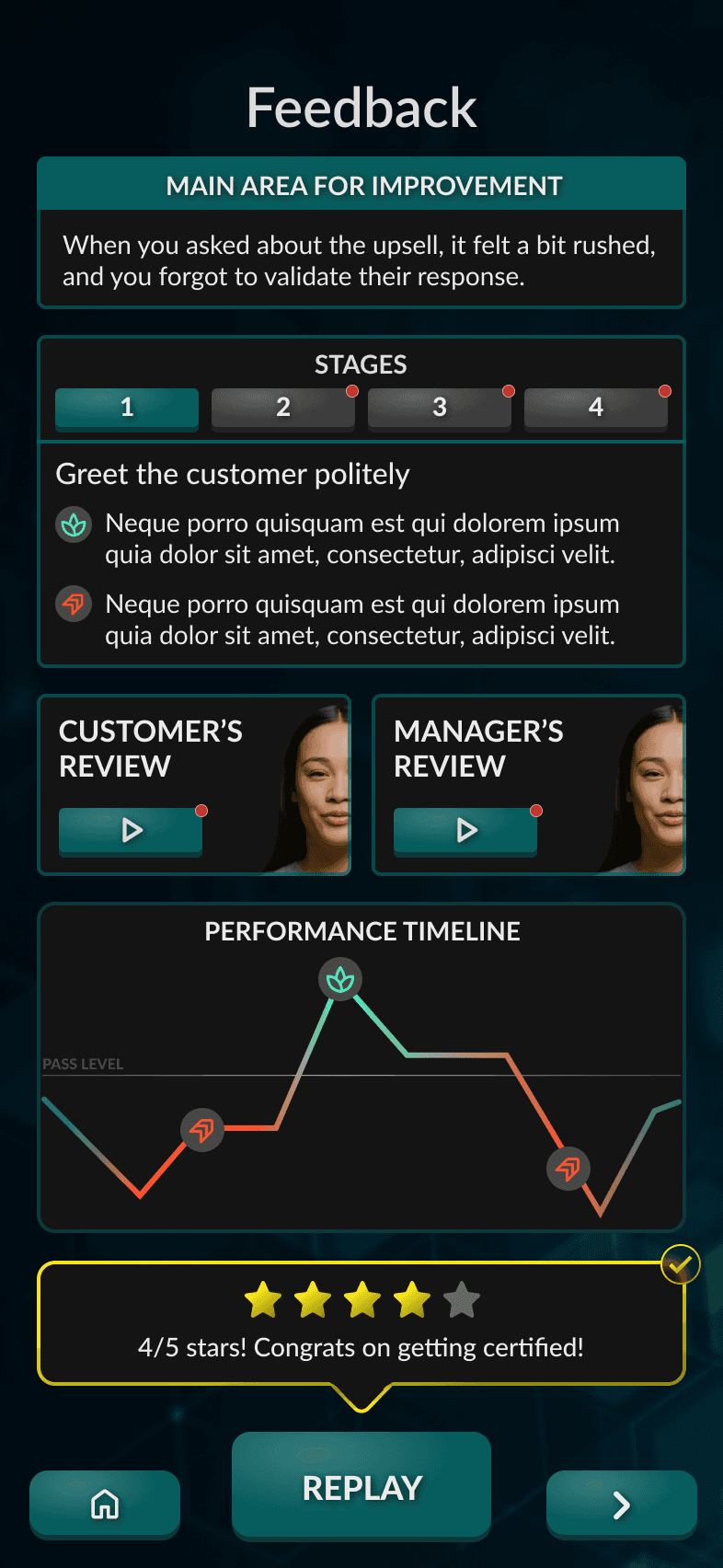
The last moment was the summary shown once the conversation ends, where the learning consolidates. My first instinct was to make it rich: graphs, light statistics, a data-driven breakdown. Some of that fell away early, but I held onto graphs for a while. Only once the feedback was written in plain language, telling users clearly what they did well and what to work on, did it become obvious the graphs no longer fit: they added visual weight without understanding, and on a small screen after a quick session, that's the overload that makes people skip feedback entirely.
So I chose clarity over cleverness: the summary had to be read, or it taught nothing. It shows the stars earned, an overall takeaway of what to improve next time, and a breakdown of what the user did well and could do better against each goal. They finish and immediately understand three things: how they did overall, where they succeeded, and what to work on next, without wading through statistics.
Giving up the graphs was a deliberate trade-off, arrived at gradually. It made the product look less sophisticated on the surface, but it made the feedback genuinely usable, which mattered far more for a tool whose whole value depends on people reading it and coming back.
Across all three moments, one lesson held: designing with AI meant the design problem didn't stop at the screen, it extended into how the model behaved, what it scored, how fairly it judged, when it stayed quiet. It's a lesson I now carry into any AI product. Whether the balance worked, the results bore out: 94% of users found the feedback helpful. It isn't perfect, the scoring is reliable now but still leans slightly conservative, and tightening that is the clear next step, but it succeeded at what mattered most: people trusted it, learned from it, and came back.

Iteration 1
Iteration 2

Iteration 3
Iteration 4
Iteration 4
Iteration 5
Solution
Designing for voice first, supporting typing for the real world, and learning most people typed.
Why voice was the heart of the experience
The most natural, immersive way to practise a conversation is to actually speak it, so voice was always the heart of the experience, the version I most wanted people to use. But designing only for voice would have ignored where these users actually are. A frontline worker on a break might be in a loud staffroom, on a busy shop floor, or somewhere public where talking aloud to their phone feels awkward, especially for the more self-conscious users the product was built to help. If voice were the only option, those moments would lock people out.
Supporting both, but not as equals
So I supported both speaking and typing, but not as equals. The risk of offering a keyboard was that people would default to typing, the easier, lower-pressure option, and quietly avoid the speaking practice that's the actual skill being built. To protect that, I made the inputs deliberately unequal: the press-and-hold-to-talk button was large and centred, the obvious primary action, while the keyboard was a small button off to the side, visible and available but clearly secondary. The goal was to make speaking the obvious default and typing the deliberate exception.
What the data showed
The post-release data showed the tension was real. Even with voice emphasised, most users reached for the keyboard: 56% used text, 31% voice, 14% both. The risk I'd anticipated played out. Emphasising voice expressed one of the product's core principles, realistic conversations: a real conversation is spoken, not typed, so speaking was always the truest form of the practice. But forcing it would have worked against the product's whole purpose. I also had a hunch, reading how anxious this audience was, that typing could act as a gentler entry point, a way for the most nervous users to start engaging at all, then build toward speaking as their confidence grew.

The resolution
That, to me, is the real resolution of the tension. Supporting both inputs was the right foundation: it met users wherever they were and never forced an anxious person into the highest-pressure action before they were ready. What the data sharpened was the next problem, not whether to offer both, but how to design the journey between them, nudging people from typing toward speaking as their confidence grows. That progression, through context-aware prompts or encouragement over time, is exactly the kind of problem I'd want to take on next.
Impact
Live with five customers, and the data showed it worked: people came back and measurably improved
Skills RealTalk shipped and is live with five enterprise customers, putting the product into the hands of real frontline teams in production. But the result I care most about isn't that it launched, it's the evidence that it actually works.
The behavioural evidence: people came back and improved
Two kinds of data tell that story. The first is behavioural, drawn from the product's analytics across live usage at the enterprise customers. It shows people doing the one thing the entire bet depended on: coming back. On average, users replayed each module more than three times, exactly the repeated practice the desktop product never got out of people. And as they repeated, they measurably improved: on a first attempt at a scenario like "Challenging Conversation," users got around a quarter of it right; by their best attempt, that climbed to over 80%, closing roughly three-quarters of the knowledge gap. The same pattern held across modules. Sessions stayed short, mostly five to twelve minutes, confirming the bite-sized format worked.
What users told us
That behavioural data matters because it's the hard evidence behind the softer, self-reported results. In a post-training survey of around 35-40 users, 87% felt more confident talking to customers, the single outcome the product exists to create, and 92% felt more empowered to handle conflict and complaints. So the two lines of evidence reinforce each other: people objectively got better through repetition, and subjectively felt more confident as a result.
Why the gains trace to the design
The feedback system I'd invested the most in was borne out too: 94% found the feedback helpful, direct validation of the work to make it fair, clear, and motivating. And the engagement was no accident, nor forced. Nothing required users to replay a module; the goals, the scoring, and the gamified feedback were built to make them want to. People came back voluntarily because the experience was designed to pull them back, and since the measurable improvement came through that repeated practice, the gains trace directly to those design decisions.
Being precise about the evidence
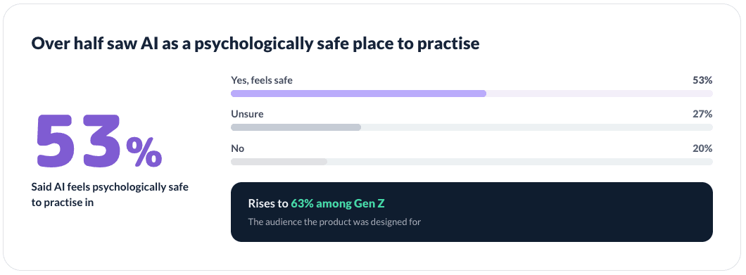
It's worth being precise about the evidence. The performance data comes from real usage and reflects genuine behaviour; the survey is self-reported, from a modest sample of around 35-40. Neither alone would be conclusive, but together they point the same way, and the consistency between what users did and what they said gave the team strong confidence the product was doing its job. The respondent base also skewed young, the largest group aged 18-25, consistent with the Gen Z audience the product was designed for.
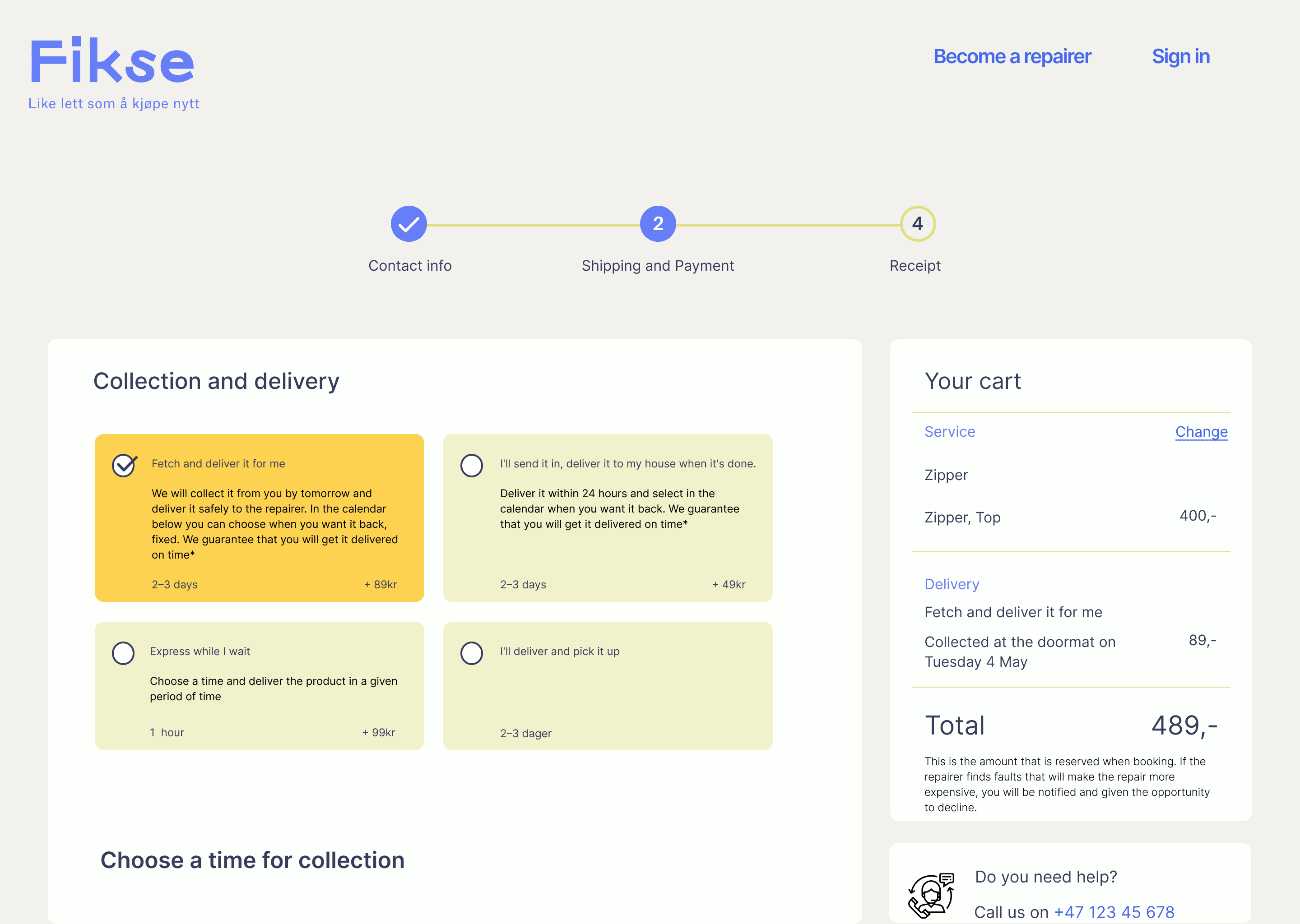
Solution
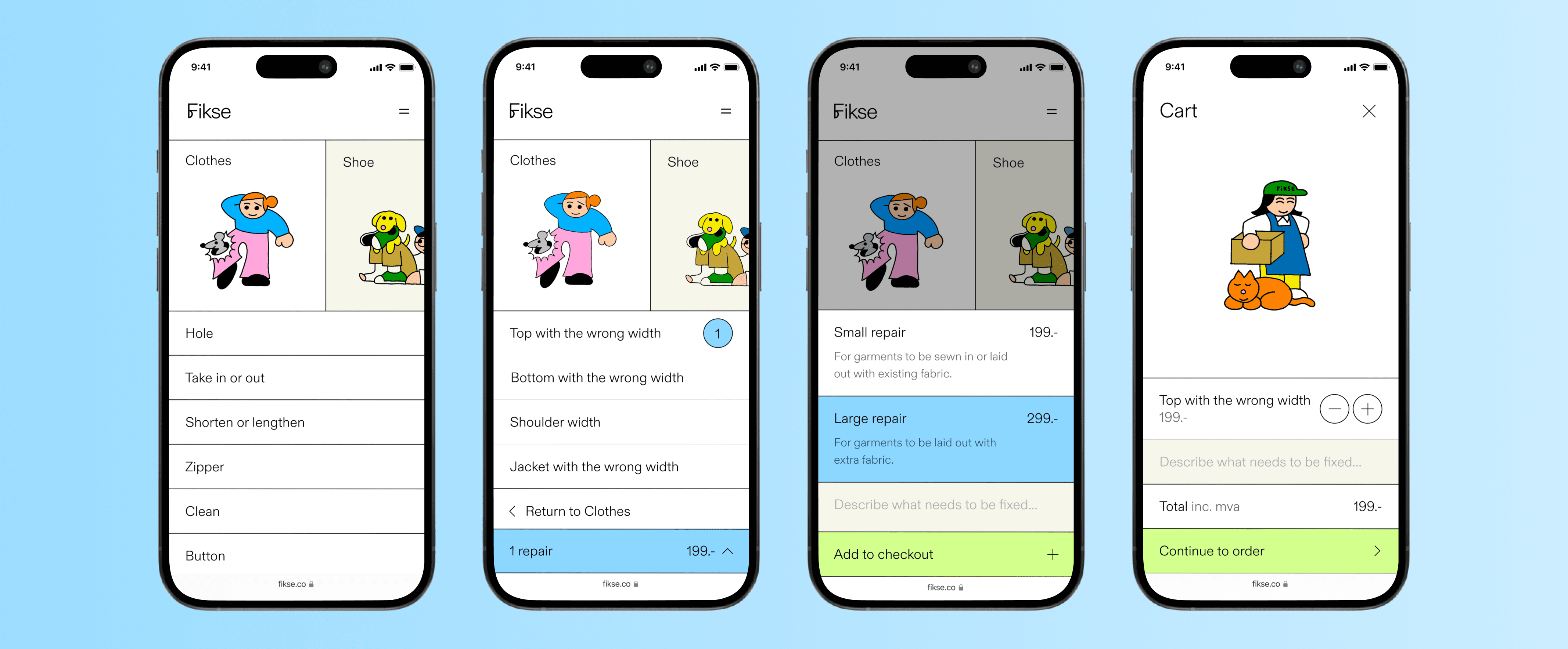
Restructured the presentation and categorization of information by grouping repair options where they naturally fit together. The "After" solution provides less 'information overload' and helps users choose the correct repair option.
Before
After
Implemented two standardized repair pricing models with information about each repair and a visual highlight when selected.
Before

After
Users can provide a detailed description, specifying the relevant information about the issue with the garment to the repairer. The previous design did not have a user repair description.
Before
After
2023, April
19
8
700+
60%
5 Design Awards
Research
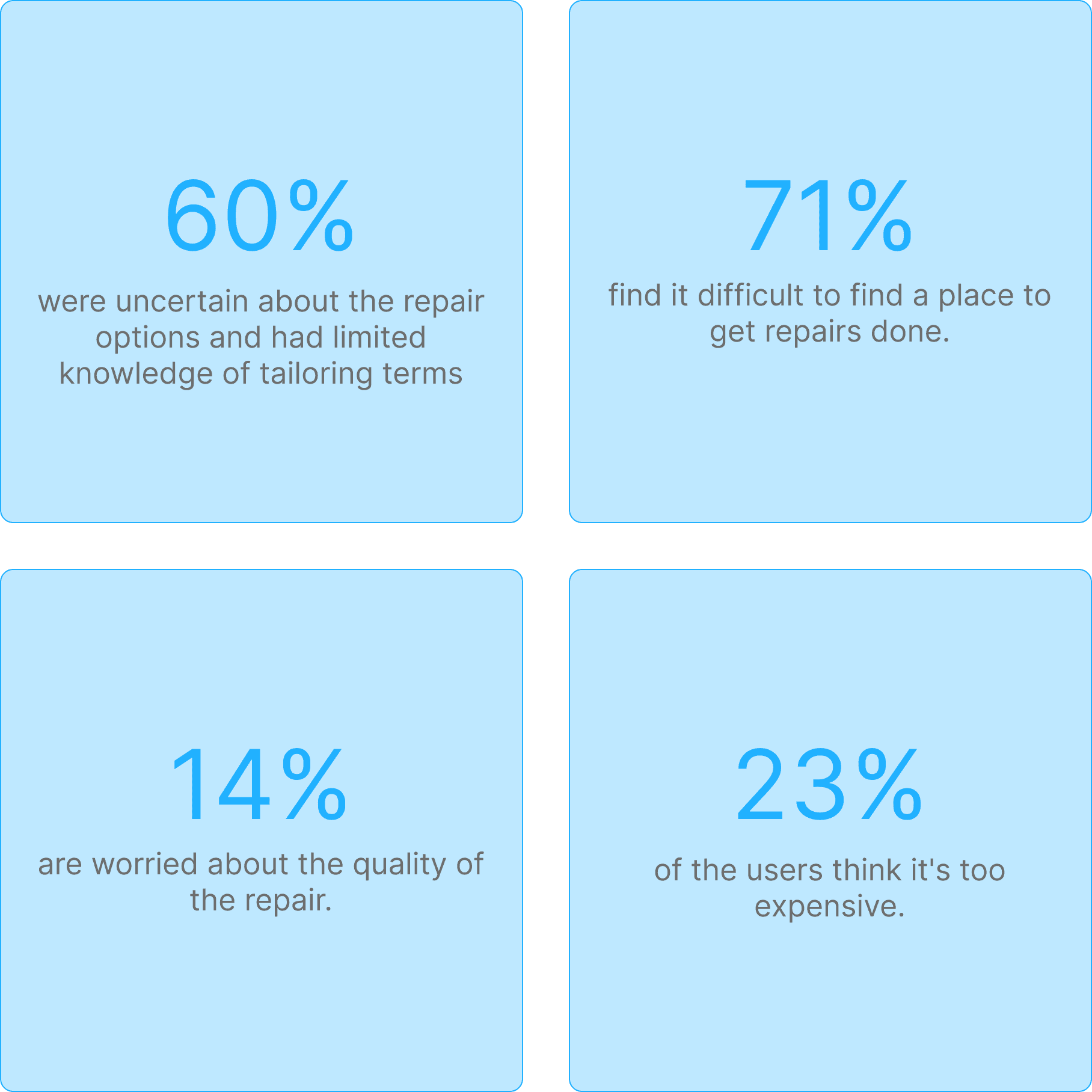
To understand user experiences and identify pain points, we conducted interviews, workshops, and evaluations with our users and product owners to gain detailed user insights.
Sixty percent of users aged 20 to 40 had limited knowledge of common tailoring terms such as "seam" and "take in." This gap hindered a smooth user experience and created confusion among users when choosing a repair option.
Design Limits User Input on
Repairs and Communication
The existing design forced users to choose preset repair options without allowing them to add their own descriptions of the issue. Users could communicate with the repairer only during the physical delivery of their garments to the workshop.
Users Uncertain If Lower Prices
Mean Lower Quality
Users were confused about the varying prices among different repairers, questioning the reasons for the price differences and whether cheaper options indicated lower quality.

Research-Driven Start Built Our
Strong Foundation
By starting with a research-intensive approach, we established a solid foundation for our work.

Yunus, 33
"I'm not familiar with tailoring at all, so I don't know which repair option I should choose."
Fredrikke, 46
"Quality is my main concern. I worry that cheaper repairs might mean sacrificing quality."
Marthe, 42
"The prices for repairs can be expensive. It makes me hesitate to order a repair, even when I need to."
Hanna, 28
"Quality is my main concern. I worry that cheaper repairs might mean sacrificing quality."
User persona: Frank

Frank, 35
Salesperson
User persona: Markus

Markus, 39
Lawyer
Seeks an efficient booking system for tailoring and repairs, avoiding multiple shop visits.
As a hiker, he needs reliable repairs to quickly fix rips and damages.
He is unsure about repair options like "take in" or "mini repair," fearing that this uncertainty could lead to mistakes in service requests.
He struggles to find time for repair visits and seeks a service that integrates smoothly into his routine.
Pain points
Confusion over terminology
Overwhelming choices of repair options
No pre-drop-off communication
Perceived complexity of process
Confusion regarding pricing
Causes
Information overload
Overwhelming choice during booking
No option to describe repair order issue
Too many repair options
Too many unclear pricing options
User journey: Marie
Marie, a real estate agent, recently noticed a tear in her favorite blazer just before a crucial client meeting.
She seeks clear repair options on the Fikse platform to make confident repair choices.
She expects clear and efficient communication with tailors to ensure accurate and satisfactory repairs.
She prefers to mail the blazer due to her busy schedule.
Marie, a real estate agent, noticed a tear in her favorite blazer before a crucial client meeting. She opted for Fikse's online platform for their repair services.
She visited Fikse's platform to choose a repair option but hesitated, unsure about the appropriate choice for her issue—whether 'mini repair' or 'patching'.
Marie hesitated briefly before choosing 'patching'. However, she remained uncertain about whether it was the right choice and worried about potential cost implications.
Marie wanted to describe her blazer's complex tear during the booking process but lacked a feature to write her own description. This left her concerned about potential repair times and costs.
Marie hesitated, preferring to describe her garment issue and seeking clear communication with the tailor before deciding whether to send the blazer by mail due to her busy schedule. She is also confused why there are five price options and wonder which to choose.
After thinking it over, Marie decided to visit the nearest Fikse tailor in person to discuss the repair details, opting not to make an online booking and payment.
At the tailor's shop, Marie explained her repair needs clearly, received confirmation on the repair method and cost, and scheduled the drop-off, ensuring her blazer would be ready in time for the event.
Marie skipped using the Fikse platform and visited the tailor in person to discuss her issue and pay, adding extra effort and complexity to the process.
Sketching
In this phase, the design team explored a variety of ideas and sketches, prioritizing creative diversity and avoiding tunnel vision. We embraced the principle of "More is more," fostering an environment of open contribution without premature criticism. Here are some of our sketches:

Prototyping
The design team brainstormed and created prototypes from the best concepts, transforming them into wireframes to visualize the user experience. This iterative approach allowed for continuous adjustments to address user concerns and ensure an efficient and user-friendly solution. Here are some of our prototypes:

Design Iteration 1
To determine the best way to help users understand repair options, we conducted a workshop to develop an ideal user flow and information architecture. It became clear that we needed to categorize options, group repair options where they fit together, and present the repair flow so that users can easily understand which repair option suits their needs.


Upon sharing the initial design with the design team, I identified the need for an improved hierarchy. We made the product section larger but retained the same information architecture.

Once the hierarchy was finalized, we incorporated a fun personality into the interface for the final design.
Design iteration 2
To help users understand pricing options, we held a workshop with the Product Owner and our repair partners. We introduced two standardized pricing options based on repair size to clarify that it is about size rather than quality, making it easier for users to choose the right repair service.

Initially, there were five different pricing options, which made users feel overwhelmed, as they perceived them to be expensive.

We then simplified the pricing options to two standardized options based on repair size rather than quality. This change simplified user choice based on their needs.

Design iteration 3
There was no user description box in the original design, so the design team added a text box for users to provide detailed descriptions of their repair orders.

We iterated on the placement of the user description box in the user flow based on user testing, finalizing its placement when users chose a repair option.

User testing
We recruited 15 users and presented scenarios and design concepts with prototypes for feedback prior to development.
Positive overall responses confirmed our design direction. Additionally, user feedback identified valuable future enhancements.
Yunus, 33
"I'm not familiar with tailoring, but the new layout and repair flow is so much easier to understand. Now I know exactly what to choose!"
Fredrikke, 46
"Quality is still my main concern, but now I'm much more confident in which price option to choose and what it entails."
Marthe, 42
"The new way you guys present the information and the order of it is so intuitive compared to before."
Hanna, 28
"This is a step in the right direction. I'm really picky about the details of the repair. In the future, maybe I can upload a pic or video?"
Future enhancements
Design Handoff
I created a separate Figma file for developers and added a glossary explaining each Figma page. Additionally, I developed a high-fidelity prototype to enhance communication efficiency.

I included detailed design notes to assist engineers in estimating the effort required for each feature and design element. Using our design system, I specified the components and styles in the "Dev Notes," along with their respective pages for easy reference.

Meet Fikse